
Grid and alignment
Using the grid
Web designers often use a grid to help them position content on screen, within the container box.
Grids are routinely used for designing print products. Newspapers, example, column-based layouts. Sometimes, a headline a picture might span two, three or four columns. But it rarely two and a half columns, because that tends to look messy.
Whatever you’re working in print or online, if you can line up blocks of content, it makes your design look tidier.
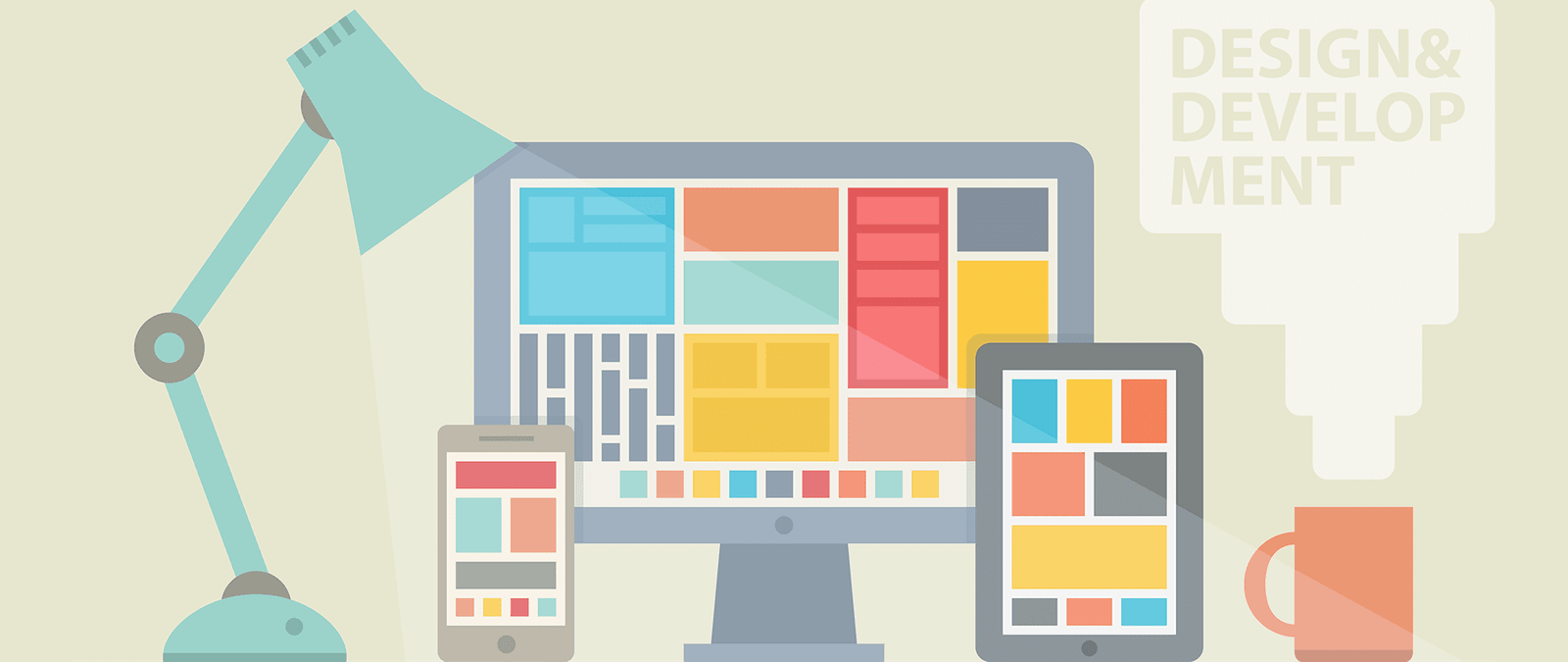
Take a look at the website for the Drupal content management system www.drupal.org. The grey stripes have been overlaid to show the 12 column grid that is the foundation of this design.
The top blue section is divided into two halves. The first white section contains three boxes, all aligned to the same grid. Some of the content within these boxes is centered, but most of it sits tightly against the edge of the column. Towards the bottom of the page, the design is two-column again, and aligned to the same id. Notice how well all the content on the left is aligned, from e logo down to the footer links.
Not everything as to sit rigidly on the grid: you Can break out of it for emphasis, and to create some pace in the design. But, if nothing lines up, a web page can look amateurish or chaotic.
Tips for good alignment
To ensure your web page lines up well, follow these steps:
- Mark up your content correctly, using the right HTML tags, to identify a heading or a list item, for example. By default, HTML brings consistency, ensuring that all headlines and bullets line up.
- Take care when adding spacing using CSS (changing the padding and margin around an element). This can introduce inconsistencies that throw out the natural alignment that HTML gives you.
- Be careful if you’re using a visual editing system to your web pages. They will often let you place content wherever you want on the page, but won’t alert you if you’re a few pixels out in lining things up. That can lead to designs that look sloppy.
- It’s easier to create a strong alignment, and the impression of good design that goes with it, if you align content wit the left or right edge of the page or content box. If you center content, the alignment is harder to see. Centered paragraphs are also harder to read, because the start of each line is harder to find. Newcomers often want to center everything, but you should limit your use of center alignment to a few carefully selected parts of your design.
Thinking above the fold
As well as column based layouts, there’s another idea the web has borrowed from the newspaper industry: the fold.
When broadsheet newspapers are laid out for sale, they’re folded across the middle and only the top half can be seen. The bit that’s on show is said to be “above the fold”. Newspapers are designed to have their major headlines and photos in this top half of the page, so that people are drawn to them and pick up the paper. The newspaper’s branding also appears prominently in this top half, so that people can recognize it immediately.
In web design, the term “above the fold” is used to refer to the first screenful of content. It’s what people can see without having to scroll to scroll the page, so it is their first impression of your website. It’s essential that your website’s identity or branding, and its navigation, appears above the fold. By having multiple columns of text, you can also start several different stories above the fold and invite people to click to read more or scroll down the to finish reading.
Of course, the fold doesn’t appear at the same place for everyone. It varies depending on the screen resolution, browser used, and the number of browser toolbars in use. If you’re assuming a minimum screen height of 768 pixels, a good place to think of the fold is being 575-590 pixels down the page. But remember that this is the minimum and that people will see lots of different sized screenfuls.
People don’t always notice the scrollbar, so you need to provide a visual cue to encourage people to scroll down the page. An easy wav to do this is to box some of the content, and stagger where the boxes end. People understand that if they can’t see the bottom border of the box, they haven’t seen everything.
Organizing information
Within each web page, you need to create a hierarchy of information. It needs to be easy for visitors to see what’s most important on any given page, and easy for them to skim-read the page to find what they’re looking for.
Think of it like a newspaper. The size of the headlines, and their position on the page, tells you a lot about the relative importance of different stories.
Here are some tips for organizing the content on your web page:
- Larger text looks more important than smaller text.
- Things higher up the page tend to be more important than things further down the page.
- Be consistent. If you have 20 different sizes of text, it be difficult for people to gauge their relative importance. Use up to three different types of headings which are consistently formatted. Using the HTML <hl> to <h3> tags correctlywül enforce consistency by default.
- Use bulleted lists and subheadings to structure your content. You can create them using HTML, so they’re part of the language of navigating the web.
- You can use contrasting color or spacing around elements to call attention to them. Video on demand company LoveFilm (www.lovefilm.com), for example, could use a text link to bring people into its subscription process. But it uses a bright green button with space around it, so that there’s no mistaking the most important action on this page.