

Contrast
Elements on a page should either be exactly the same or they should be strikingly different. For example lets look at the two following words: Zebra Zebra . The two words Zebra are both a shade of red, and are very close in their RGB origin, but when placed side by side they create a confusing visuals.
In this situation if we change the words to be strikingly different we would have something more like: Zebra Zebra . The juxtaposition of the the strikingly different red and black create a strong visualization and color relationship between the two words.
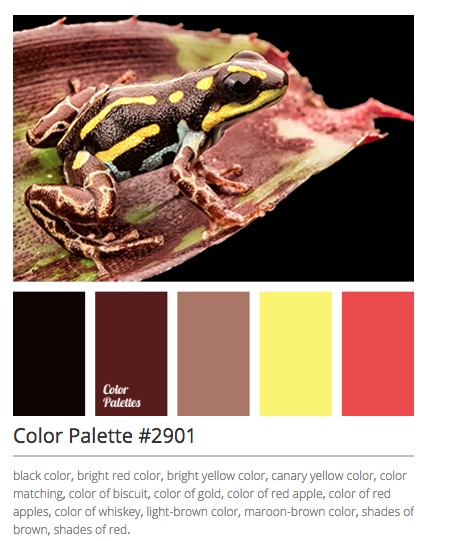
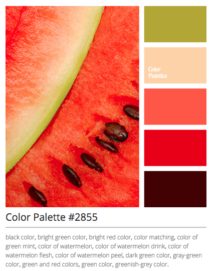
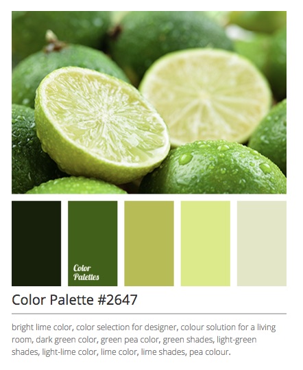
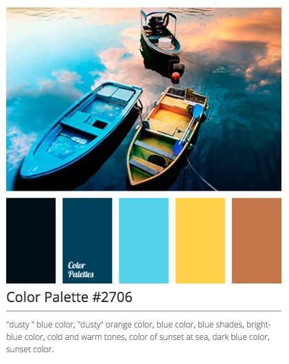
To avoid this think about researching and implementing complementary colors in a project. Here are some contrasting color examples from colorpalettes.net
Font selection is another important pillar for good design aesthetics. Similar to color, it is wise to select fonts that have strikingly different similarities to add balance to the visualization.
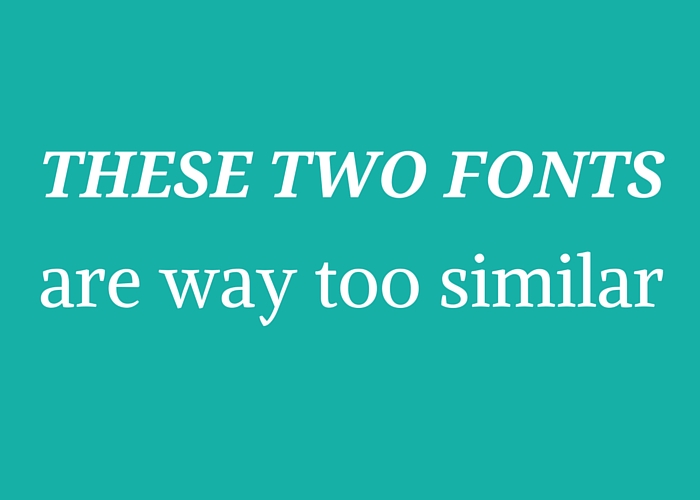
As a guide, it is often wise to use the pairing of a Serif style font & a Sans Serif style font. Serif style fonts have a little line attached to the endings of the individual letters form, similar to an old fashion type-setting. Sans Serif is devoid of that line. Try not to use more than 2 fonts on a page. You can always use contrasting size to create variations on your page, instead of dueling font chaos. There are online resources for font pairings as well. Designschool.canva does a nice job of setting basic parameters for font discovery: