Alignment
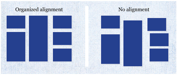
When you are designing a web page you should begin with a plan. Create a hierarchy of importance for the content on your page on a separate document, don’t just take out the bulldozer and start moving dirt around. Throwing images and visualizations on an html layout is similar to tossing darts at a dart board. It is a demonstration of poor practice, poor patience, and will contribute to major alignment miscommunication.
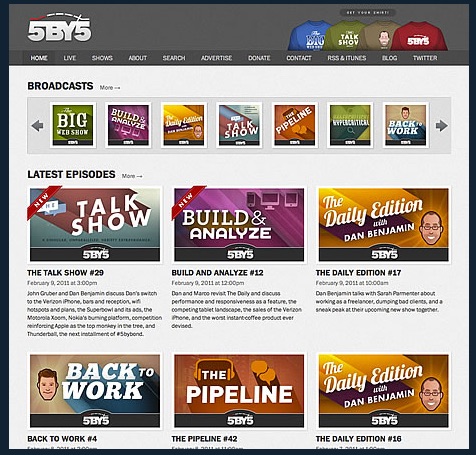
Be cognizant of spacing of the relationship between your fonts, images, and web elements. Select one style of text alignment (left alignment, center alignment, right alignment) and maintain that throughout the design. Try to find a rhythm to connect objects in regards to positioning, attach imaginary or non imaginary rulers, borders, or strings between objects on the page, providing a wireframe for connecting elements.

When you become more familiar with intermediate levels of html and css, tables and grid systems can be great resources to quickly developing an aligned page. Some of those grid systems are: html tables, 960.gs, Bootstrap, and Foundation.


